We Live a Sweet Life Filled with Wild Adventures.


Showing posts with label pretty paper. Show all posts

Tuesday, June 21, 2011

Chevron, Banners and Dots, Oh My!

A little while back I posted about some Save the Date inspiration. I'm finding more and more that writing my thoughts out and putting inspiration pictures all together really helps me make my mind up...because just a few short days after that post, I finally finally made a decision and ordered my Save the Dates.

I kept coming back to the two below. I couldn't get over how adorable the banner was in this first one and the gray chevron stripes in the second one make my heart pitter patter.
Image via Oh So Beautiful Paper

Image via Minted

I was really struggling with finding a background for all of my previous designs and kept skipping over the chevron graphic because I thought it was too modern for the feel we were going for, but then I remembered this from my invitation searching, a banner and chevron together:
Image from Etsy seller Cheerupcherup
I loved the combination of the chevron and the banner, but I wanted the banner to be more free flowing. The invitation below has been in my invite inspiration folder forr-evah, I am so in love with this invitation, there was no way I wasn't going to use it as my inspiration foundation.

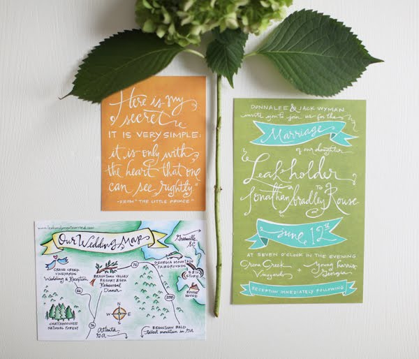
Image via Invitation Crush by Oh My Deer!

I had accomplished the background for a graphic element and the banner for a whimsical touch. Onto the wording, I had used the Wedding Chick's templates very early on in our engagement and remembered loving the wording on one of the templates, so I stole graciously copied it. I now had my fun statement that I wanted to incorporate.
I knocked out the design in an afternoon and was ready to order. (The trickiest part was creating the perfect banner. Remember, I'm using our good friend Microsoft Word, and yes they have an insert, shape, banner option but it was too structured; I was dreaming of the free flowing, softer edges of the banners like the invitation above. After hours of playing around, I found the 'edit points' in the drawing tools and started manipulating the standard banner into my own and wa-la...no longer ridgid.)

I had read tremendous reviews about Vistaprint and signed up a few months ago, well the first part of June I received an email for 100 FREE postcards plus free uploading of images. This helped put a fire under my ass, since I only had 1 week to get my order in. I opted for the color front, gray scale back and then paid $8.99 for matte recycled paper rather than the free gloss version. That put my total order, plus shipping & processing to $17.47...or seventeen cents per Save The Date. I ordered the slow option, 21 days, but much to my surprise they arrived 14 days later!
Here they are, our Save the Dates:

The front and back
Close up of front: gray chevron background with navy, peach and gray font

Close up of the back: all in gray. Banners and chevron!

I'm very happy with the way they turned out. The wording is fun and laid back. The chevron stripes add some structure to the whimsical banners and the dotted borders. The font (which is Milk and Cereal, Digs My Heart, and Never Writes Back from KevinandAmanda) has the perfect balance of handwriting and whimsy. I'm relieved to have these done and feel like I now have the ideal bouncing board to begin work on my invitations. These babies are addressed and being sent out into the world as you read this!

Hive, tell me about your Save the Dates!

Thursday, June 2, 2011

Saving the Date

In my last paper post I wrote about my indecision making about invites. I realize I was a little premature with the invite post before the save the post but I have it set in my mind that my Save the Dates need to be cohesive with my invitation suite, they just do. I want one element on every single piece of paper used in the wedding. Obsessive, Honey? Yes. That's why I started with invite inspiration, now it's to the drawing board with Save the Date inspiration. Paper inspiration posts are one of my favorites.

I have decided we won't be using pictures of ourselves on our Save the Dates...mainly because we hadn't done our engagement pictures at the time of designing our Save the Dates. I was kind of bummed initially, because who doesn't like seeing a picture of themselves on every friend's refrigerator for six months? I kid. I was actually bummed that we wouldn't have a Save the Date like this:
Image via Love vs Design/Photo by Love me Sailor
Can't cry over spilled milk, right? This just means that instead of showing our smiling faces in the Save the Date, we will get to incorporate them into our invitation suite, yessss. I had to move past all the picture inspiration and focus on creative text and presentation instead.

Creative Text Save the Dates
Image via Wedding Wire/Designed by West Willow

Image via Style me Pretty/Designed by Marilyn Chien

Image via the Bridal Blog/Template by Wedding Chicks
Graphic Design Save the Dates

Image via Etsy Westwind Days


{Image via Minted}
Whimsical Save the Dates
Image via Kaboodle/Designed by Emandbee

Image via Oh So Beautiful Paper

Utilizing Custom Stamps
{Image via Pinterest, from Flickr}


Image via Instructbles
Save the Dates with Creative Touches

Image via This Next
{Image via Pinterest, from Postcardsandpretties}

Image via Dot Girl Blog

Customized and Illustrated Save the Dates


Image via Rifle Made

Swiss Cottage Design
See the transition from simple to impossible? Much like my invitation drooling, I started basic and kept stepping up the complication level. As much as I would die to have a custom illustrated Save the Date, it's just not in the cards for the Honey's. Looking at all the other inspiration pictures, I concluded that I like three elements: a graphic background, a whimsical element, and a fun statement...all to be accented with pretty font and our colors on a little postcard. Quite the tall order. The fact is I could go back and forth on my entire paper design for days months, but the good news is I have made progress and created a Save the Date that hopefully reflects our wedding vibe, shows creativity within our means (aka Microsoft Word) and will make our guests smile.

Who else is obsessive like me and started with invitation inspiration before the Save the Date inspiration? Tell me about a must have element for you Save the Date!

Saturday, May 21, 2011

Invitations Made me Insane

Hive, I'm not kidding, designing my invitations are driving me carazzzzzy! I have invitation ADD and I have an addiction to looking at invitations, it makes for a very bad combination. Just when I think I finally found something I just have to have, along comes something else I have to have a little bit more. I'm designing my invitations, all my paper rather, by myself...with the most basic processing platform: Microsoft Word. Don't get me wrong, I'm enjoying it. I wish I had the funds to purchase Adobe Illustrator to just make it a tad easier. Here's my all-over- the-place train of thought:

It started with simple font and simple hearts:

{iHeartyou via Etsy seller, Little Sparks Creations}

I was fixated on the heart invite for a few months, and I love that Mrs. Lox went with this awesome design. Then I started migrating towards tree or nature inspired invites.

Lovebirds in a Tree Invite:
{Oh So Beautiful Paper}

Willow Tree Invite:

{via Invitation Crush}

I sat with a blank document forrrever and tried to figure out how I could re-create something like this, but everything I did just looked like clip art. I altered my searching and came across the image below which convinced me I needed banners and white font.
Oh pretty banners:


{Invitation Crush by Oh My Deer!}


Banner with Chevron Stripes:


{via Etsy seller Cheerupcherup}

The colored paper and white typing makes the statement in this suite, courtesy of Mrs. Pain au Chocolat:


{Miss PAC, Weddingbee}

Solid color with white text:


{I Should Have Been An Astronaut}

Next came the brackets:


{via Etsy seller Shine Invitations}


{Image via Minted}

So, to summarize, I like hearts, trees, banners, chevron, brackets, color and white text. Sweet, Honey, way to be all over the place. Looking at the images I have saved and comparing them to the ones I have recreated, I've learned this:
  • I love letterpress
  • I like dark backgrounds with white text
  • I'm drawn to non-computer generated images
  • I like having something to use on all paper elements (bracket, banner, etc.)
And you know what outlining this tells me? I have a challenge ahead of me. I can't afford letterpress. My home printer doesn't allow for white text printing. And, I'm no artist so all my abilities lie in the computer generation. I'm screwed ya'll.

I'm going to walk away and:


Hive, who else had invitation scatterbrain while searching for inspiration?!