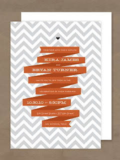
I kept coming back to the two below. I couldn't get over how adorable the banner was in this first one and the gray chevron stripes in the second one make my heart pitter patter.
 |
| Image via Oh So Beautiful Paper |
| Image via Minted |
 |
| Image from Etsy seller Cheerupcherup |
| Image via Invitation Crush by Oh My Deer! |
I had accomplished the background for a graphic element and the banner for a whimsical touch. Onto the wording, I had used the Wedding Chick's templates very early on in our engagement and remembered loving the wording on one of the templates, so I stole graciously copied it. I now had my fun statement that I wanted to incorporate.
I knocked out the design in an afternoon and was ready to order. (The trickiest part was creating the perfect banner. Remember, I'm using our good friend Microsoft Word, and yes they have an insert, shape, banner option but it was too structured; I was dreaming of the free flowing, softer edges of the banners like the invitation above. After hours of playing around, I found the 'edit points' in the drawing tools and started manipulating the standard banner into my own and wa-la...no longer ridgid.)
I had read tremendous reviews about Vistaprint and signed up a few months ago, well the first part of June I received an email for 100 FREE postcards plus free uploading of images. This helped put a fire under my ass, since I only had 1 week to get my order in. I opted for the color front, gray scale back and then paid $8.99 for matte recycled paper rather than the free gloss version. That put my total order, plus shipping & processing to $17.47...or seventeen cents per Save The Date. I ordered the slow option, 21 days, but much to my surprise they arrived 14 days later!
Here they are, our Save the Dates:
| The front and back |
| Close up of front: gray chevron background with navy, peach and gray font |
| Close up of the back: all in gray. Banners and chevron! |
I'm very happy with the way they turned out. The wording is fun and laid back. The chevron stripes add some structure to the whimsical banners and the dotted borders. The font (which is Milk and Cereal, Digs My Heart, and Never Writes Back from KevinandAmanda) has the perfect balance of handwriting and whimsy. I'm relieved to have these done and feel like I now have the ideal bouncing board to begin work on my invitations. These babies are addressed and being sent out into the world as you read this!
Hive, tell me about your Save the Dates!
No comments:
Post a Comment