Having designed, created and assembled every part of these, they were certainly a labor of love but I'm also relieved to have them completed. You remember my mailbox reaction? That has dissipated and has been replaced with giddiness each time I check our mailbox and see it filled with RSVP's. Without further ado, the Honey Invitations! Starting with the envelope, that I'm oddly in love with:
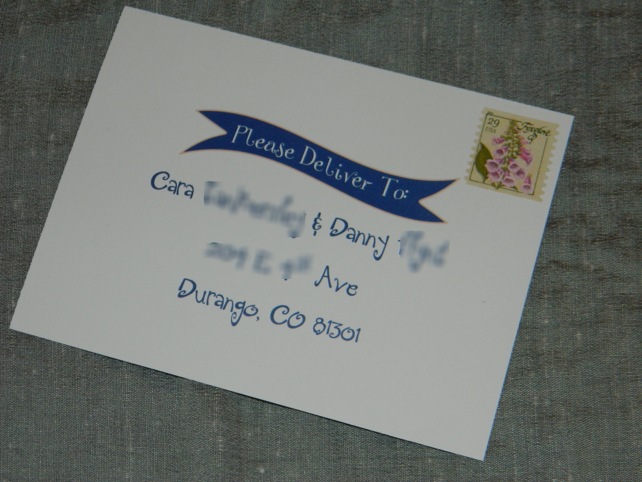
I chose the A7 Cobalt Blue envelopes from Cards and Pockets. For the guest address label I used an oval and for our return address I used a round label. Our invites only required one .44 stamp, and the Garden of Love stamps were just perfect.
 |
| Guest Address Label |
 |
| Honey Return Address Label |
After opening the flap, carefully of course, they saw this sneak peek:

And after pulling out the little bundle, they held this in their hands:


I fell in love with this idea a long time ago, and while a map is not completely necessary for our wedding since we are having the ceremony and reception at one place, even some local guests aren't too familiar with the Vallecito Lake area (in addition to our out of town guests). I turned to Mrs. Ballet Flat's tutorial on how to make your own map and followed it step by step, check it out here. I mounted the map on one side of the card stock and the directions on the other, this was both cost and time effective.
The RSVP postcard was tucked just behind the map insert:

The postcard came from Vistaprint. We choose to forgo the more formal "M" option and instead used the straightforward prompt of "Name(s)". I used Absolutely & Bummer for our "yes" or "no" options, two words I use daily.
And the actual invitation!

I incorporated the chevron stripes and the banner from our Save the Date. I was so smitten with banners, I was determined to use them. The two fonts on the invites are courtesy of Kevin and Amanda and are Three Dates, One Night from Scrapbook Fonts and Pea NJH Whimsy from Fonts for Peas. The labels used Digs My Hart from the Scrapbook page. The wedding insert and the invitation were both mounted on dark gray matte card stock from Cards and Pockets.
I used twine from Whisker Graphics to literally tie the inserts together and used the Mini Moo cards to showcase our engagement pictures, which on the back, directed guests to our wedding website for additional details.


Here's the entire Honey Suite:

We took as much formality out of these as we could, hoping to set the tone for our laid back, whimsical affair. We wanted the invitations to be fun and unique, and the response so far has been just that. Our guests have appreciated the different approach to a wedding invitation. Sure Miss Mole and I happen to have pretty similar tastes (or inspiration pictures, thanks to the 'Bee!), but luckily for all of us, the majority of guests are seeing twine tied invites for the first time and don't recognize it as a trend.
So, there it is, our sweet invitation suite! I hope you enjoyed them, it's a relief to have them done and be sharing them with the Hive. Up next I will weigh in on the cost of our DIY invites.
What elements are you incorporating in your invitations that may be considered a trend in the wedding blog world? I for one, still think that twine is brilliant, trend or not :)
No comments:
Post a Comment